Be the Answer
We recently worked on the rebrand of financial company Equals - developing a series of glass discs inspired by the coin motif at the heart of the new identity. Using perspective, depth of field and light, we crafted a visual system that moves between abstraction and clarity - expressing the brand idea of ‘be the answer’ through a simple yet distinctive visual metaphor. Designed to work across the wider identity, the CGI assets bring focus, depth and consistency to the brand across every touchpoint.
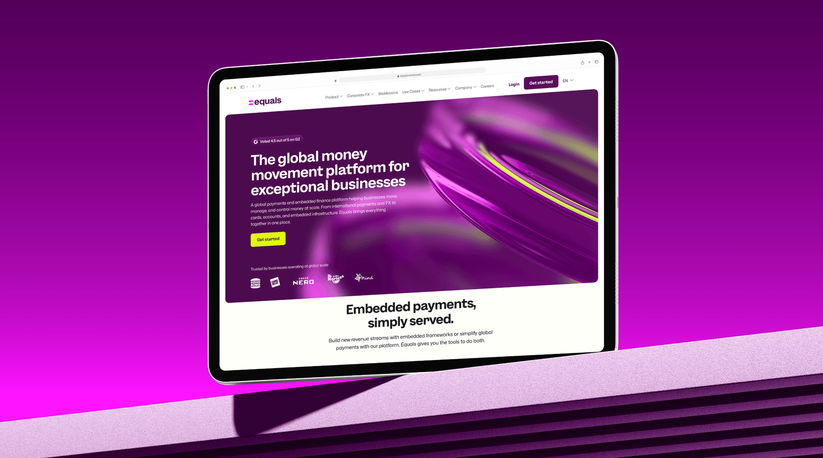
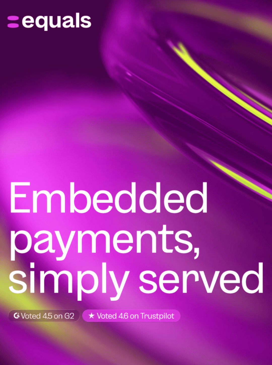
Our CGI assets formed the foundation of the new visual language, which agency SomeOne expertly extended across the wider brand identity. From digital experiences and social content to campaign applications, the glass discs were woven throughout the system, creating a consistent visual thread that gives the brand its distinctive sense of depth, clarity and recognition.
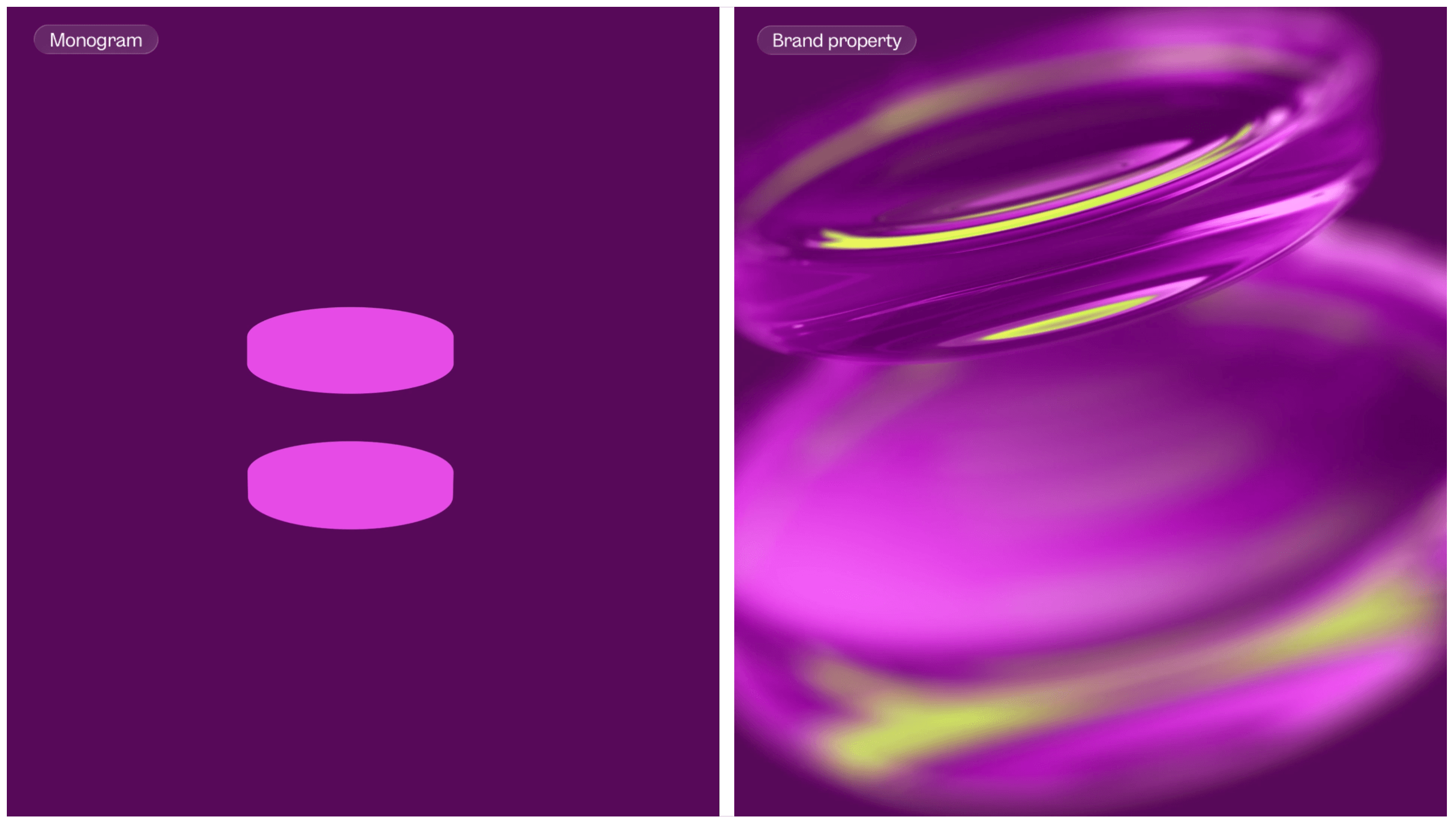
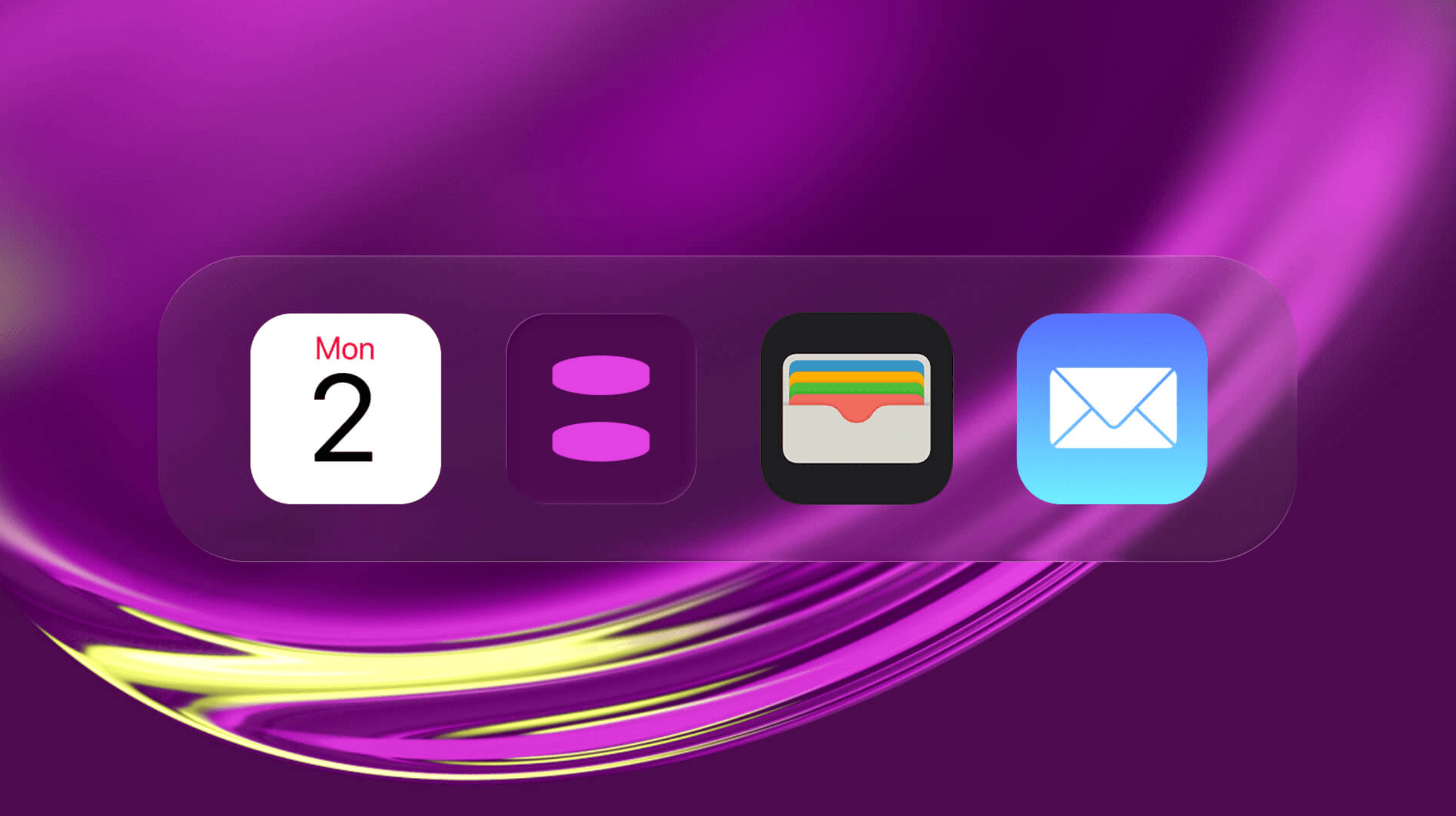
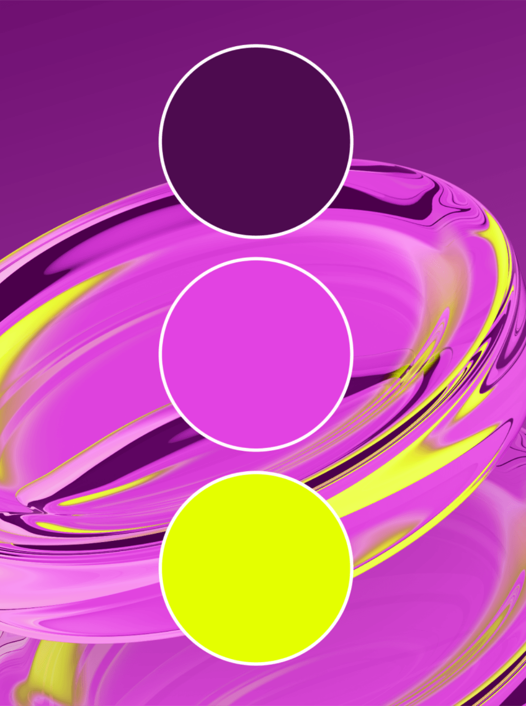
A look at some of our initial R&D. We explored an even more graphic approach to bring out the zingiest of colours within our renders.

Scroll