Practical Brilliance
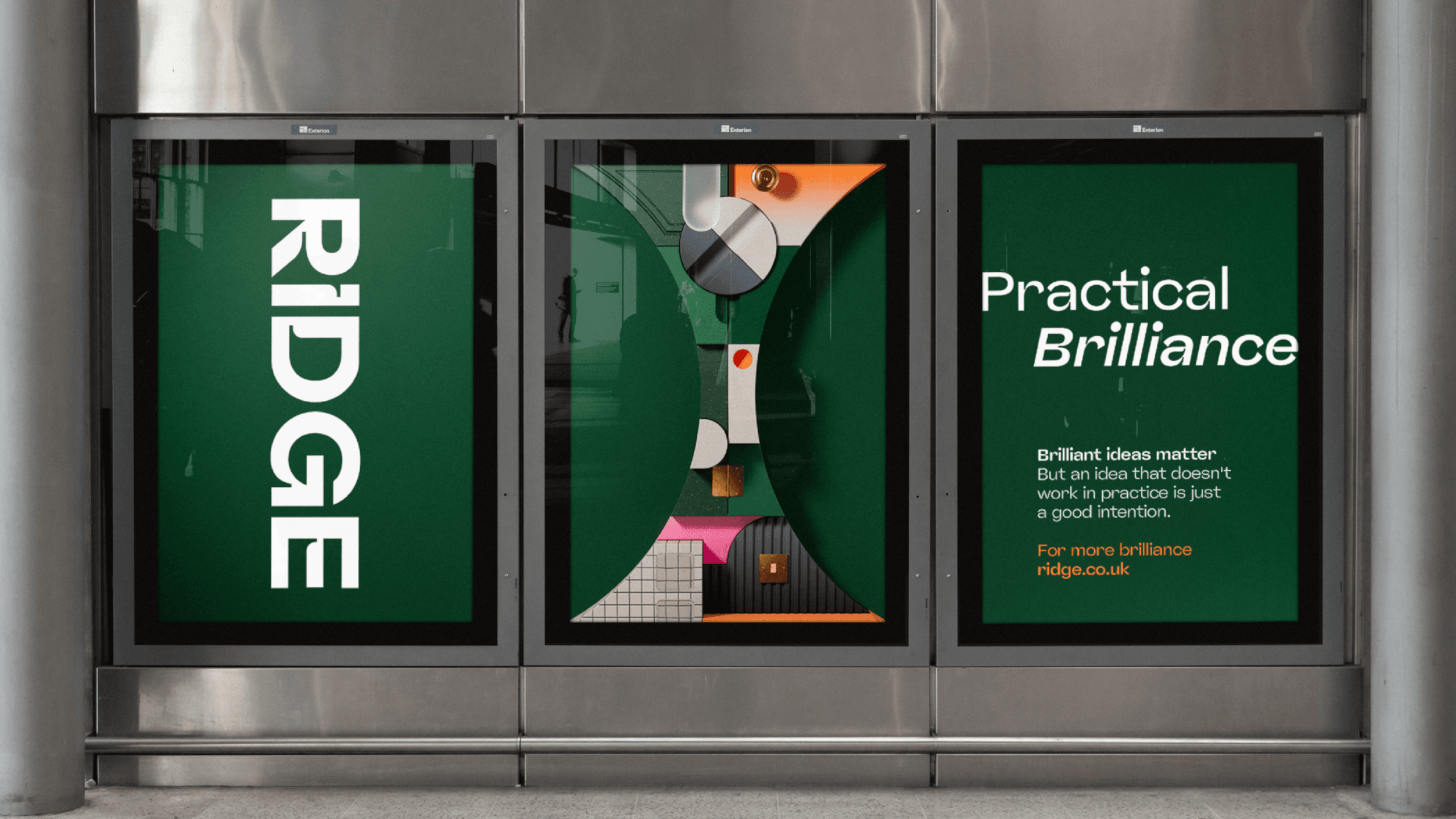
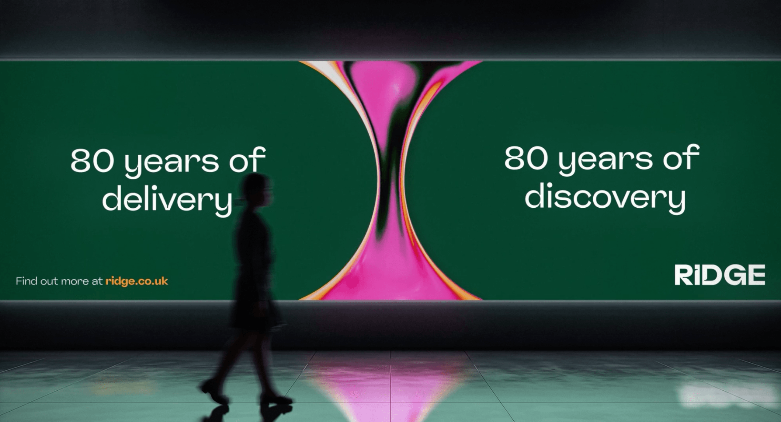
We were brought on board by SomeOne to create the CG and motion for a recent rebrand of construction company, Ridge. At the heart of the new identity is a dynamic, hourglass-inspired brand property. This fluid, textural form acts as a structural metaphor for Ridge’s defining strength: seamlessly guiding projects from initial enquiry to the moment builders move in. From Surveys, Architecture, Infrastructure, Health & Safety and Planning—they handle everything in between. We were tasked with bringing the new Brand Pillar to life; the dynamic visual element at the heart of the identity.
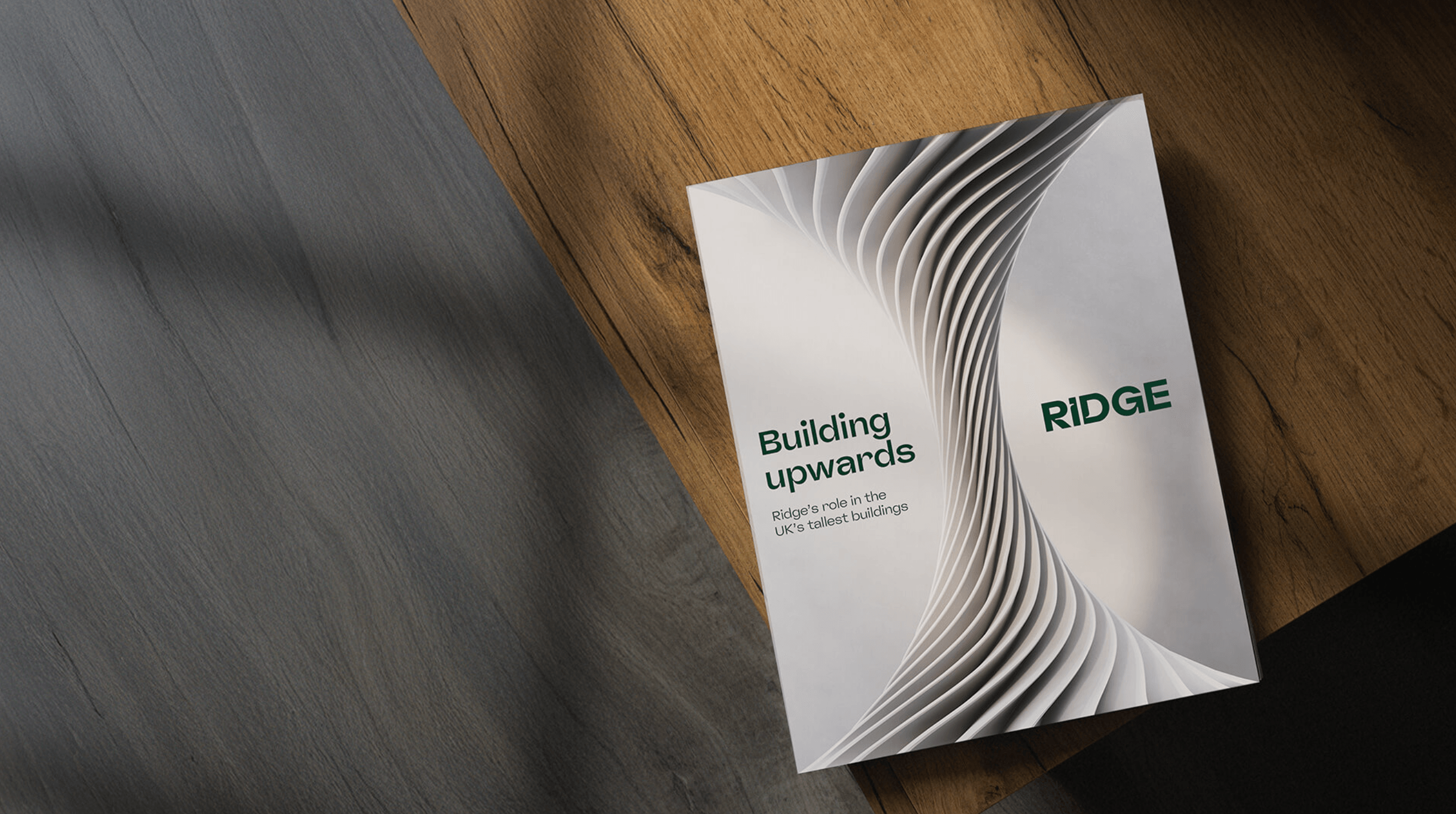
We created a series of bespoke CG interpretations, each one befitting a specific sector - from zoo feathers to architectural structures to data driven emoticons. A varied set, built to work in cohesion as well as boasting their own personal style.
The outputs were rolled out across the identity, used in print, across social and web, and featuring in OOH. The breadth of variety allowed for ultimate flexibility and gave the new brandmark a chance to shine.

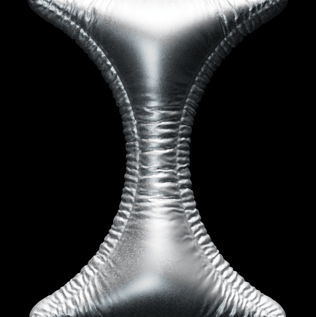
Some additional versions of the brand pillar from the cutting board - those that didn't make it to the final outputs but had amazing personality and their own merit.


Scroll